


Applications
HANDLES, KNOBS AND ALUMINIUM PROFILES FOR ELECTRICAL APPLIANCES AND OTHER SECTORS
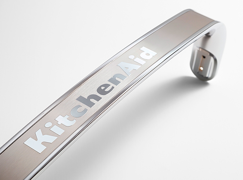
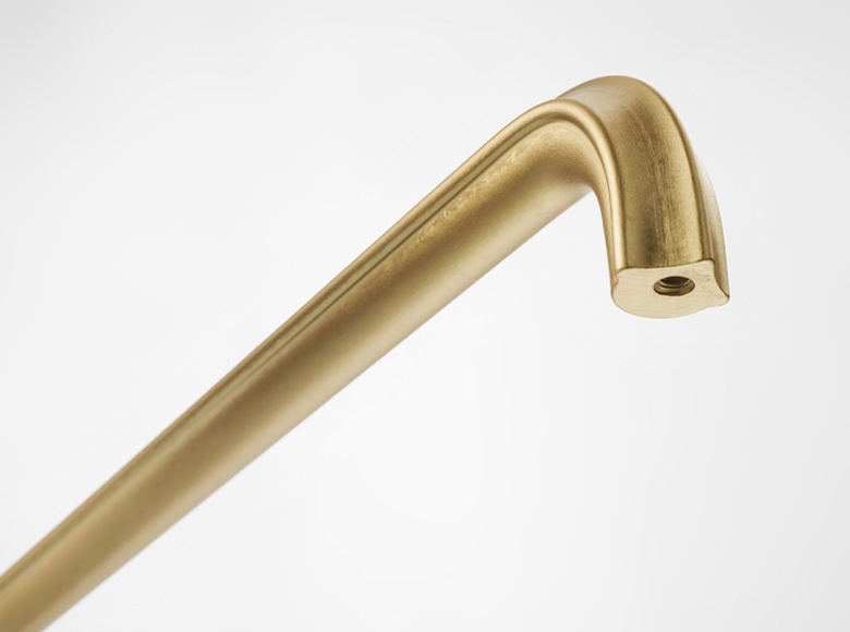
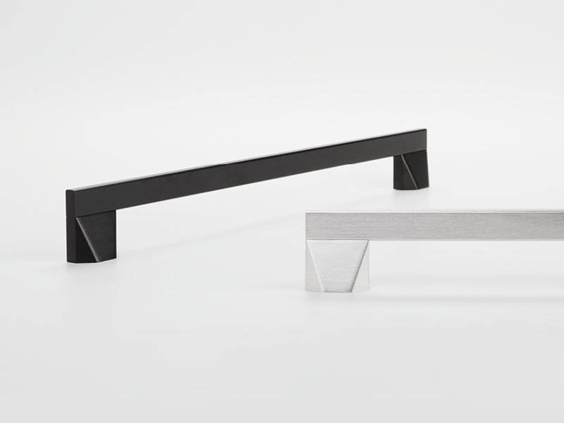
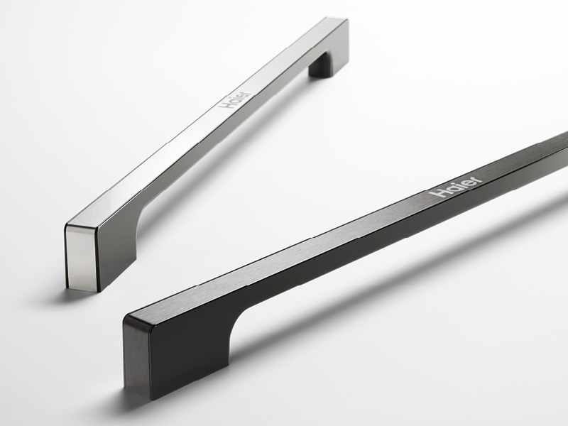
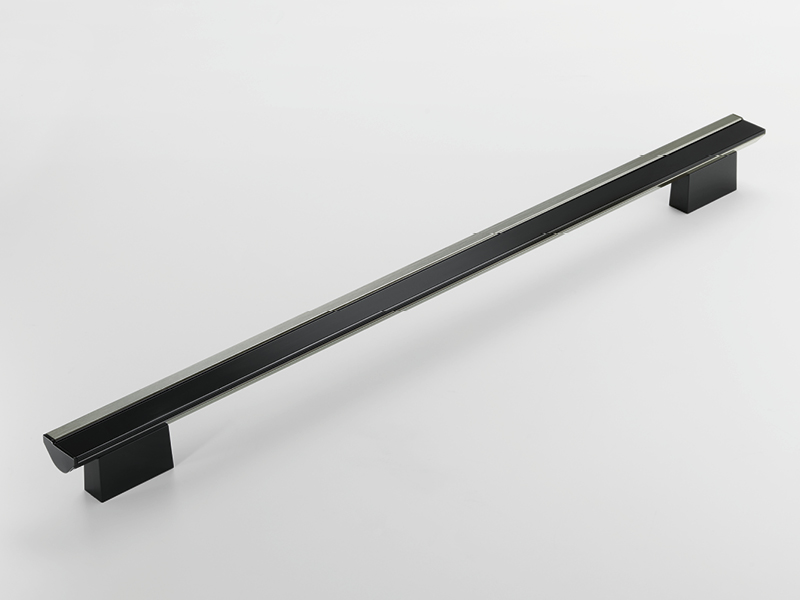
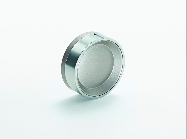
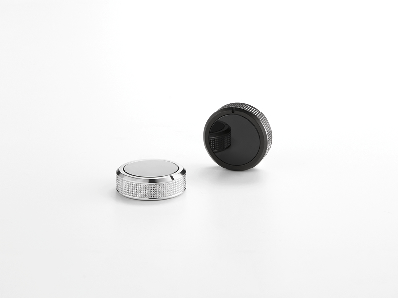
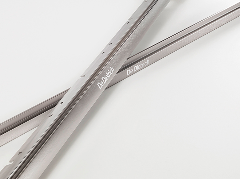
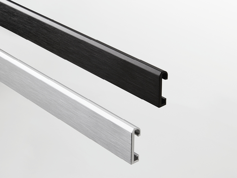
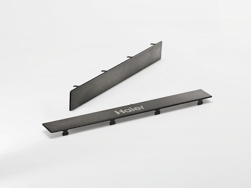
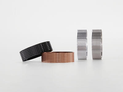
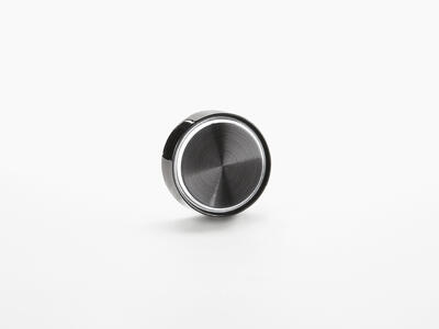
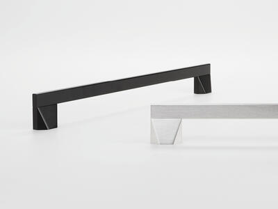
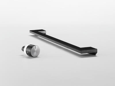
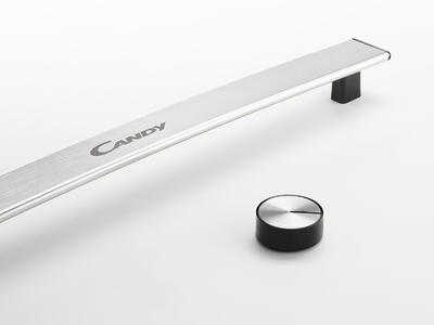
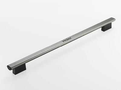
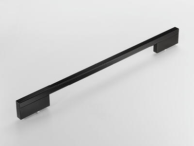
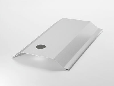
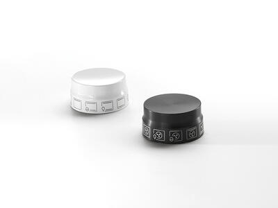
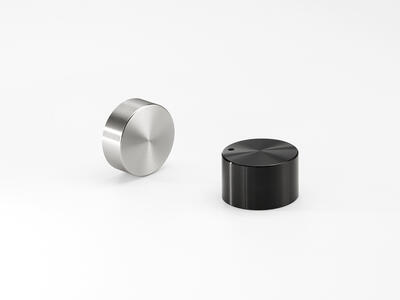
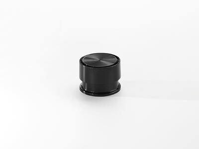
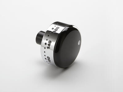
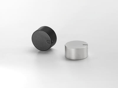
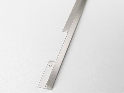
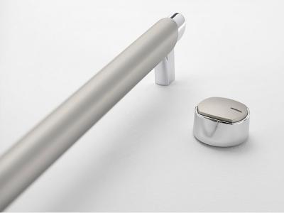
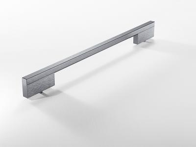
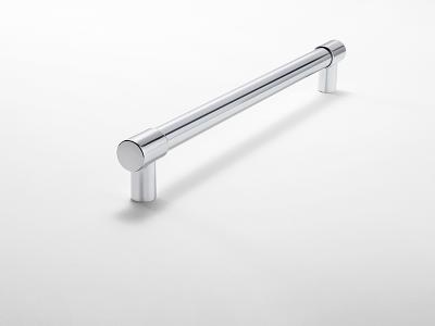
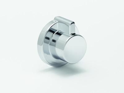
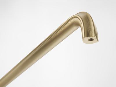
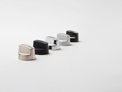
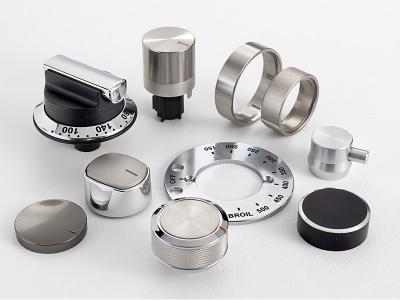
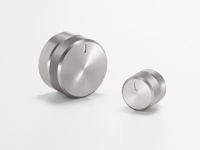
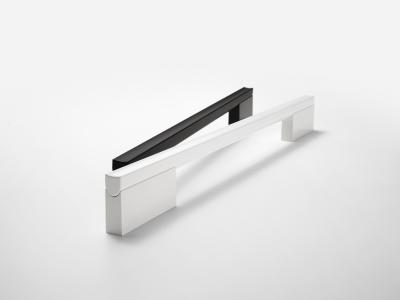
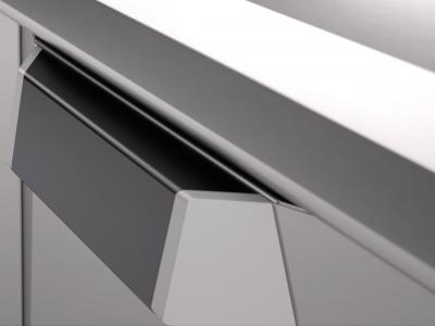
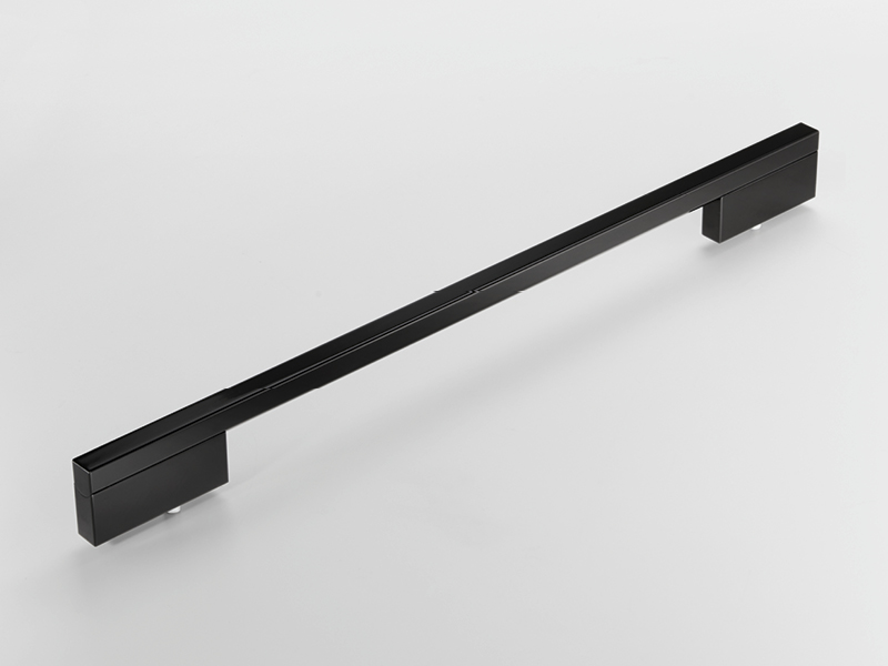
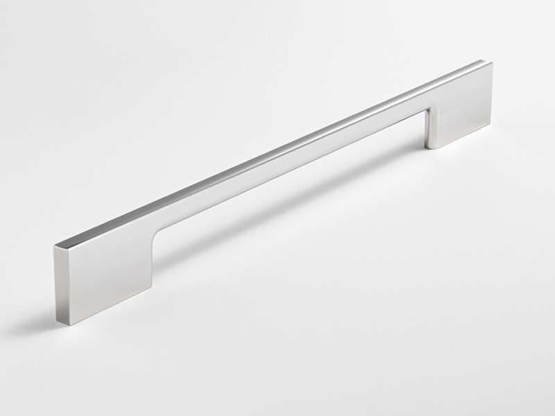
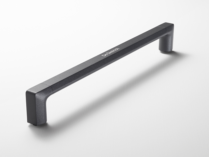
DOMESTIC
THE IMPORTANCE OF DETAILS
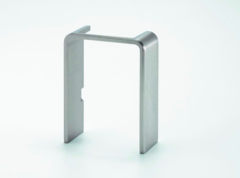
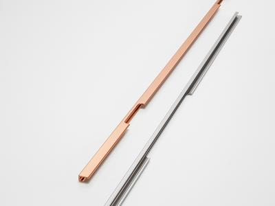
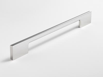
Anodica supplies solutions for aesthetic components for electrical appliances such as: ovens, cooktops, refrigerators, and works with the most important international companies operating in that sector. Our company, specialised in aluminium fabrication and treatment processes, is committed to optimising its products, ensuring the entire supply chain is involved in guaranteeing standards of excellence and adapting its production flexibility to suit each individual customer. From the design phase to the execution of complex projects, from production to assembly and delivery, Anodica guarantees a custom-built service that puts care into each detail, exactly like our products.
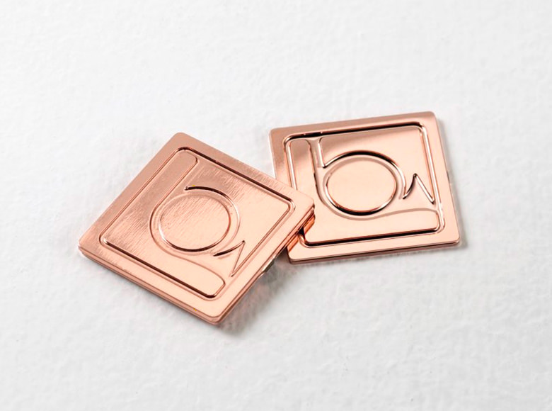
Anodica co-designs with its customers to create tailor-made aesthetic surfaces for home appliances in order to convey the identity of each brand through its aesthetic components: from the logo to panels, profiles, dials, buttons and handles. The graphic, chromatic and stylistic harmony of Anodica's finishes are characteristic of a common identity, a single underlying feature shared by all the products in the same collection thanks to a clearly recognisable aesthetic look.
Because excellence, especially when dealing with aesthetic components for electrical appliances, can never be produced on an assembly line.
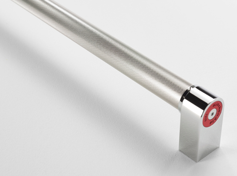
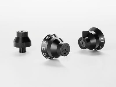
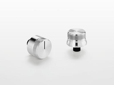
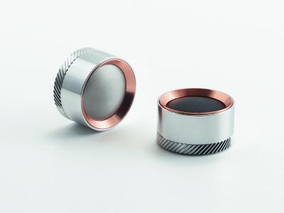
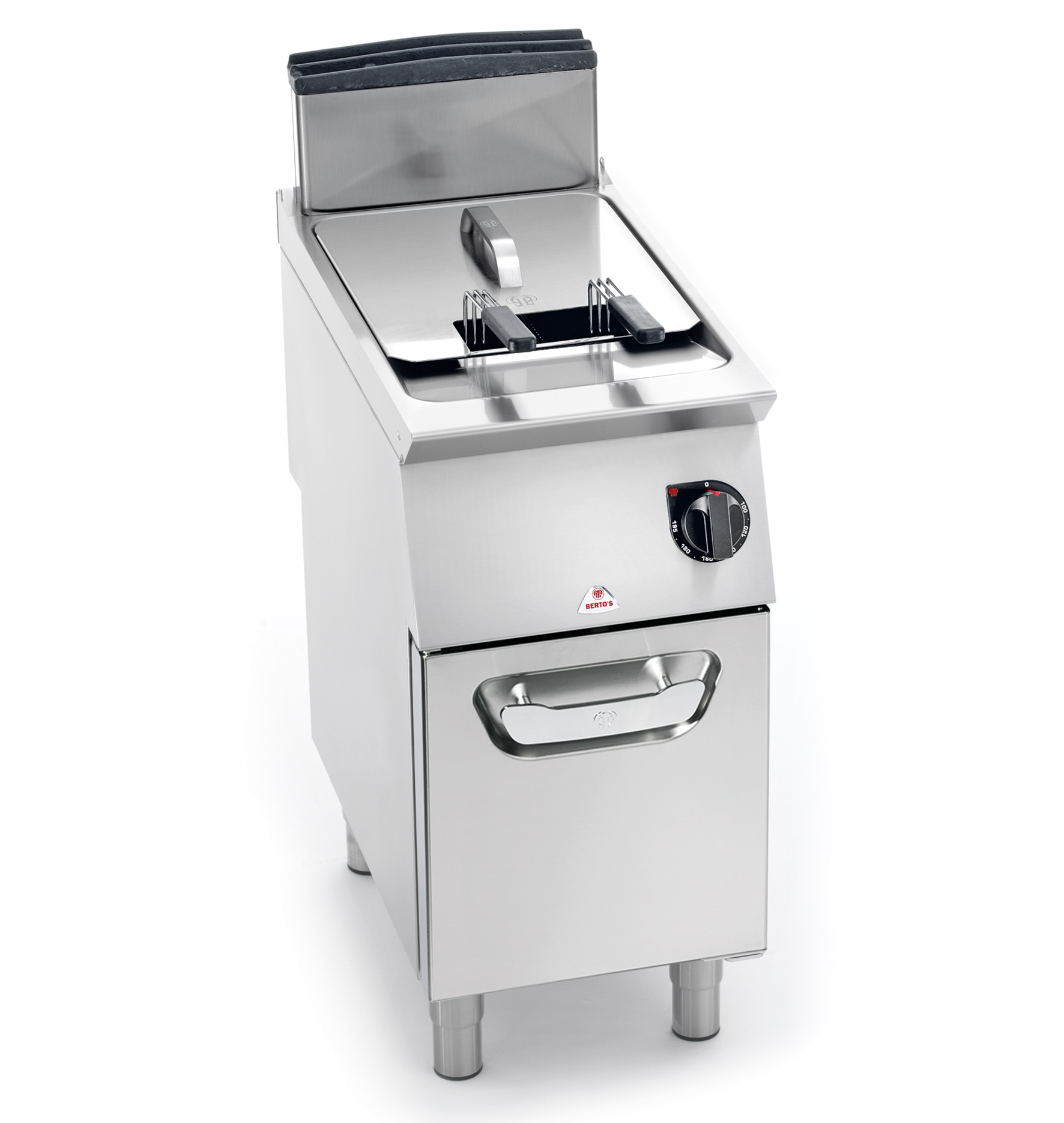
PROFESSIONAL AND RECREATIONAL APPLIANCES
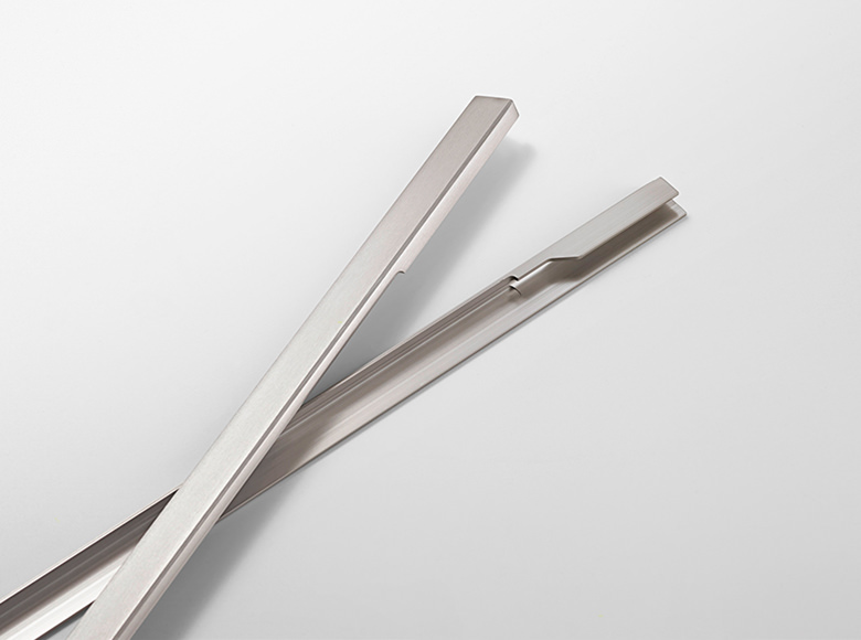
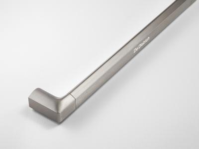
For many years, the production of components for professional appliances has meant working with stainless steel. However, the trend of open kitchen in restaurants made it recently grown the need for as much reliable but aesthetically refined solutions. That's how Anodica disclosed to professional electrical appliance components industry aluminium's unique qualities: maximum customization in terms of colors, special finishes and adaptability to aesthetic and technical requirements.
The collaboration of Anodica with companies belonging to the recreational sector goes far beyond the simple supply. We prefer speaking of co-design. To find the best technical and aesthetic answer, Anodica relies on comparison and exchange of ideas making available its experience to give support in design choices and aesthetic pairing. In this way the result is never a standard one, but it is built, or better, co-built, upon clients' wishes and necessities.

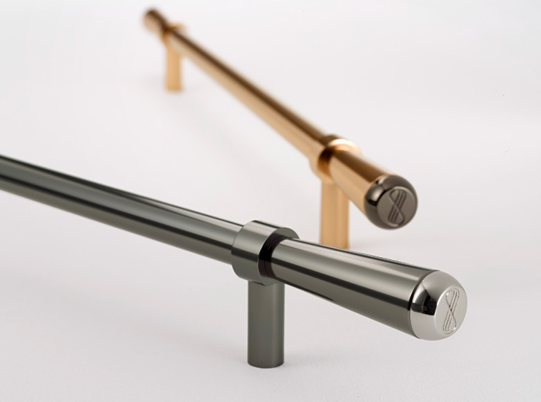
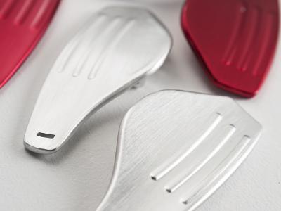
AUTOMOTIVE
SETTING IDEAS IN MOTION
The numerous types of finishes we have tested, the unusual fabrication and design needs we have met over the years and the particular aesthetic and functional challenges we have faced have all given Anodica expertise that has proven crucial in other sectors as well. Using our usual approach – one that involves an openness to dialogue and problem solving – our company is expanding its areas of application to include other sectors, including the Automotive. A challenge that Anodica decided to face with a spirit open to ideas, solutions and sharing of forces, skills and goals. With the network NAT.
Gear levers and components for aluminium cars are some products on which Anodica has decided to invest in order to extend its area of influence and respond to an audience interested in improving the details of means of transport and public vehicles. The patented antibacterial treatment, available on request, ensures antimicrobial efficacy against bacteria and virus, solidity of components over time and resistance to heat and corrosion.

Other sectors
Excellence has infinite applications. Our aim is to constantly discover new ones and make them happens.
In Anodica, research is in constant movement and tested solutions aren't limited on traditional sectors. In the course of time, in fact, has been conceived, tested and realised answers also for the sectors:
- Medical/Dental
- Designer furniture


